


When i started making CSS drawings, i didn’t know about ‘Single div CSS art’, i was very amazed by what people can draw with only one div then i felt curious to know how these drawings are made.
I went to Codepen and started to learn more about them, i found that they all use three components: ‘ Pseudo elements ’, ‘ Shadow ’ and ‘ Gradients ’.
I will give more details on how these three elements can help you make single div CSS art.
1- Pseudo elements:
Yes it’s a single div, but using pseudo elements will give you 2 other elements to style which are : div::before and div::after .
The ::before selector inserts something before the div.
The ::after selector inserts something after the div.
Think of the div as an element that goes between these two selectors.
You can use the 'content' property to insert the content you want to add. or you can keep it blank (content:' ’) and add width/height, border, background to make shapes.
2- Shadow:
The box-shadow property is not just used to add a single shadow, we can also set multiple box-shadows to generate many shapes with different color, size, spread and blur values.
    div {
      border: 1px solid;
      border-radius:50%;
      width: 50px;
      height: 50%;
      padding: 50px;
      box-shadow: 5px 5px blue, 10px 10px red, 15px 15px yellow;
    }
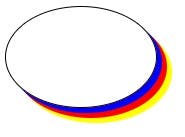 we can play with these shapes using the offset and inset options.
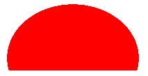
3- Gradients:
I think this is an important thing when it comes to CSS art in general, you will always find gradients, more gradients means more complexity is added to your drawing.
it can help you make shapes too by combining multiple gradients in the background-image property.
    div{
      width : 200px;
      height : 100px;
      background: radial-gradient(ellipse at 50% 82%, red 67%, transparent 52%)
    }
Demo
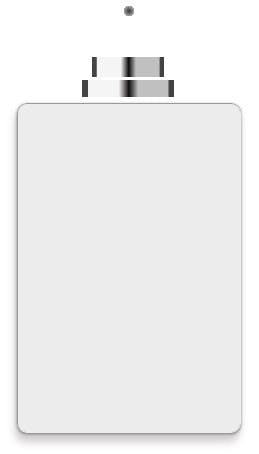
That’s all, let’s now take an example and draw this ‘Single div perfume bottle’ together :
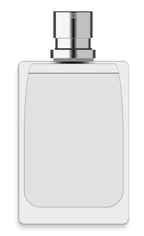 This is made up of 3 primary element:
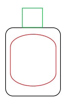
- a- The black element will be our div.
- b- The green element represents the ::before selector.
- c- The red element is the ::after selector.
That’s our single div HTML element :
<div class="perfume"></div>
Let’s start writing CSS :
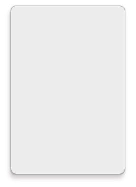
So the first thing we will take care of is the black element:
This is a div element that has a gray background color, with border-radius of 10 pixels and a box shadow to show some dimension. Notice that we are using multiple shadows here.
    .perfume {
      position: absolute;
      width: 222px;
      height: 328px;
      top: 50%;
      left: 50%;
      transform: translate(-50%,-50%);
      background: #ececec;
      border-radius: 10px;
      box-shadow: -2px 9px 8px #5d56564a, 0px 1px 3px #888;
      border-width: 1px;
      border-style: ridge;
    }
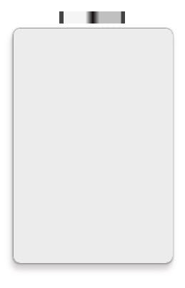
 Let’s move to the green element which we will make using ::before selector, you can see that this one contains many shapes, we are going to make them using gradients:
This is the code for our first shape which is nothing but a linear gradient of multiple and different colors:
    .perfume::before {
      content: '';
      position: absolute;
      display: block;
      width: 164px;
      height: 157px;
      top: -148px;
      background-repeat: no-repeat;
      background-image: linear-gradient(90deg, rgba(68, 68, 68, 1) 6%, rgba(245, 245, 245, 1) 7%, rgba(245, 245, 245, 1) 40%, rgba(13, 12, 12, 1) 51%, rgba(192, 192, 192, 1) 61%, rgba(192, 192, 192, 1) 93%, rgba(67, 67, 67, 1) 95%);
      background-size: 92px 17px;
      background-position: 64px 124px;

    }
Our second shape is the same as the previous one with a small size and different position.
background-image: linear-gradient(90deg, rgba(68, 68, 68, 1) 6%, rgba(245, 245, 245, 1) 7%, rgba(245, 245, 245, 1) 40%, rgba(13, 12, 12, 1) 51%, rgba(192, 192, 192, 1) 61%, rgba(192, 192, 192, 1) 93%, rgba(67, 67, 67, 1) 95%), linear-gradient(90deg, rgba(68, 68, 68, 1) 6%, rgba(245, 245, 245, 1) 7%, rgba(245, 245, 245, 1) 40%, rgba(13, 12, 12, 1) 51%, rgba(192, 192, 192, 1) 61%, rgba(192, 192, 192, 1) 93%, rgba(67, 67, 67, 1) 95%);
background-size: 92px 17px, 72px 20px;
background-position: 64px 124px, 74px 101px;
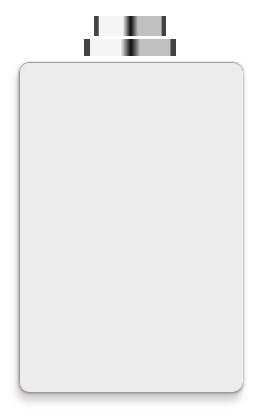
Next, it’s a radial gradient which represents the circle in the top. Notice that we added this shape before the one that goes under it. Always start with the top shapes so that it won't be covered by the next one.
background-image: linear-gradient(90deg, rgba(68, 68, 68, 1) 6%, rgba(245, 245, 245, 1) 7%, rgba(245, 245, 245, 1) 40%, rgba(13, 12, 12, 1) 51%, rgba(192, 192, 192, 1) 61%, rgba(192, 192, 192, 1) 93%, rgba(67, 67, 67, 1) 95%), linear-gradient(90deg, rgba(68, 68, 68, 1) 6%, rgba(245, 245, 245, 1) 7%, rgba(245, 245, 245, 1) 40%, rgba(13, 12, 12, 1) 51%, rgba(192, 192, 192, 1) 61%, rgba(192, 192, 192, 1) 93%, rgba(67, 67, 67, 1) 95%), radial-gradient(circle closest-side, #3f3f3f 10%, #a8a8a8 104%, transparent 3%);
background-size: 92px 17px, 72px 20px, 10px 10px;
background-position: 64px 124px, 74px 101px, 106px 50px;
After we put the previous shape, now we will add another linear gradient that goes under it, same as the first one with different size and position:
background-image: linear-gradient(90deg, rgba(68, 68, 68, 1) 6%, rgba(245, 245, 245, 1) 7%, rgba(245, 245, 245, 1) 40%, rgba(13, 12, 12, 1) 51%, rgba(192, 192, 192, 1) 61%, rgba(192, 192, 192, 1) 93%, rgba(67, 67, 67, 1) 95%), linear-gradient(90deg, rgba(68, 68, 68, 1) 6%, rgba(245, 245, 245, 1) 7%, rgba(245, 245, 245, 1) 40%, rgba(13, 12, 12, 1) 51%, rgba(192, 192, 192, 1) 61%, rgba(192, 192, 192, 1) 93%, rgba(67, 67, 67, 1) 95%), radial-gradient(circle closest-side, #3f3f3f 10%, #a8a8a8 104%, transparent 3%), linear-gradient(90deg, rgba(68, 68, 68, 1) 6%, rgba(245, 245, 245, 1) 7%, rgba(245, 245, 245, 1) 40%, rgba(13, 12, 12, 1) 51%, rgba(192, 192, 192, 1) 61%, rgba(192, 192, 192, 1) 93%, rgba(67, 67, 67, 1) 95%);
background-size: 92px 17px, 72px 20px, 10px 10px, 80px 52px;
background-position: 64px 124px, 74px 101px, 106px 50px, 70px 48px;
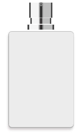 One other linear gradient:
background-image: linear-gradient(90deg, rgba(68, 68, 68, 1) 6%, rgba(245, 245, 245, 1) 7%, rgba(245, 245, 245, 1) 40%, rgba(13, 12, 12, 1) 51%, rgba(192, 192, 192, 1) 61%, rgba(192, 192, 192, 1) 93%, rgba(67, 67, 67, 1) 95%), linear-gradient(90deg, rgba(68, 68, 68, 1) 6%, rgba(245, 245, 245, 1) 7%, rgba(245, 245, 245, 1) 40%, rgba(13, 12, 12, 1) 51%, rgba(192, 192, 192, 1) 61%, rgba(192, 192, 192, 1) 93%, rgba(67, 67, 67, 1) 95%), radial-gradient(circle closest-side, #3f3f3f 10%, #a8a8a8 104%, transparent 3%), linear-gradient(90deg, rgba(68, 68, 68, 1) 6%, rgba(245, 245, 245, 1) 7%, rgba(245, 245, 245, 1) 40%, rgba(13, 12, 12, 1) 51%, rgba(192, 192, 192, 1) 61%, rgba(192, 192, 192, 1) 93%, rgba(67, 67, 67, 1) 95%), linear-gradient(90deg, rgba(208, 208, 208, 1) 6%, rgba(207, 207, 207, 1) 7%, rgba(40, 40, 40, 1) 27%, rgba(13, 12, 12, 1) 51%, rgba(40, 40, 40, 1) 70%, rgba(207, 207, 207, 1) 93%, rgba(208, 208, 208, 1) 95%);
background-size: 92px 17px, 72px 20px, 10px 10px, 80px 52px, 92px 17px;
background-position: 64px 124px, 74px 101px, 106px 50px, 70px 48px, 63px 148px;
 Now, it’s time to fill all the blank spaces between all these shapes, for this we will add four simple linear gradients:
background-image: linear-gradient(90deg, rgba(68, 68, 68, 1) 6%, rgba(245, 245, 245, 1) 7%, rgba(245, 245, 245, 1) 40%, rgba(13, 12, 12, 1) 51%, rgba(192, 192, 192, 1) 61%, rgba(192, 192, 192, 1) 93%, rgba(67, 67, 67, 1) 95%), linear-gradient(90deg, rgba(68, 68, 68, 1) 6%, rgba(245, 245, 245, 1) 7%, rgba(245, 245, 245, 1) 40%, rgba(13, 12, 12, 1) 51%, rgba(192, 192, 192, 1) 61%, rgba(192, 192, 192, 1) 93%, rgba(67, 67, 67, 1) 95%), radial-gradient(circle closest-side, #3f3f3f 10%, #a8a8a8 104%, transparent 3%), linear-gradient(90deg, rgba(68, 68, 68, 1) 6%, rgba(245, 245, 245, 1) 7%, rgba(245, 245, 245, 1) 40%, rgba(13, 12, 12, 1) 51%, rgba(192, 192, 192, 1) 61%, rgba(192, 192, 192, 1) 93%, rgba(67, 67, 67, 1) 95%), linear-gradient(90deg, rgba(208, 208, 208, 1) 6%, rgba(207, 207, 207, 1) 7%, rgba(40, 40, 40, 1) 27%, rgba(13, 12, 12, 1) 51%, rgba(40, 40, 40, 1) 70%, rgba(207, 207, 207, 1) 93%, rgba(208, 208, 208, 1) 95%), linear-gradient(#434343, #434343), linear-gradient(#939393, #939393), linear-gradient(#2f2f2f, #2f2f2f),
    linear-gradient(#878787, #878787);
background-size: 92px 17px, 72px 20px, 10px 10px, 80px 52px, 92px 17px, 80px 3px, 72px 3px, 76px 6px, 82px 8px;
background-position: 64px 124px, 74px 101px, 106px 50px, 70px 48px, 63px 148px, 70px 46px, 74px 99px, 73px 121px, 70px 140px;
 Yes it’s a little bit crazy to see all these different gradients, each with its own position, colors and size but that’s what makes our drawing looks good.
That’s all for the ::before selector, we finished the top part 😌
Let’s move to the ::after selector and add the red element to our drawing: (don’t worry, this one is easy 😅 )
It’s just an element with some border radius and two linear gradients.
    .perfume::after {
      content: '';
      display: block;
      box-sizing: border-box;
      width: 203px;
      height: 292px;
      position: absolute;
      top: 4px;
      left: 10px;
      background-color: #e1e1e1;
      border: 1px solid #1919195e;
      border-top-left-radius: 18px 151px;
      border-top-right-radius: 18px 151px;
      border-bottom-left-radius: 34px;
      border-bottom-right-radius: 34px;
      background-repeat: no-repeat;
      background-image: linear-gradient(#ebebeb, #ebebeb), linear-gradient(#2f2f2f, #2f2f2f);
      background-size: 194px 18px, 190px 1px;
      background-position: 3px 0px, 3px 18px;
    }
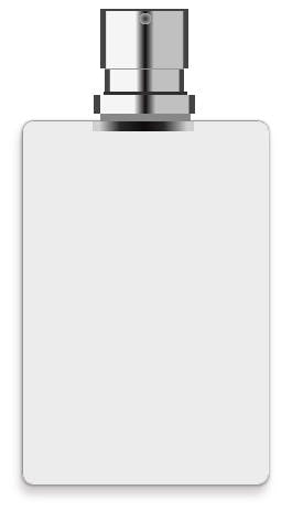
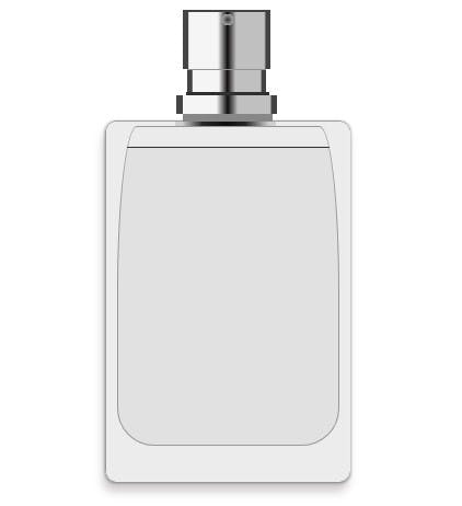 We are done ! 🥳
Hope you learnt something from this.
Check out all the code @codepen
And follow me on twitter if you would like to see more of CSS stuff 👋